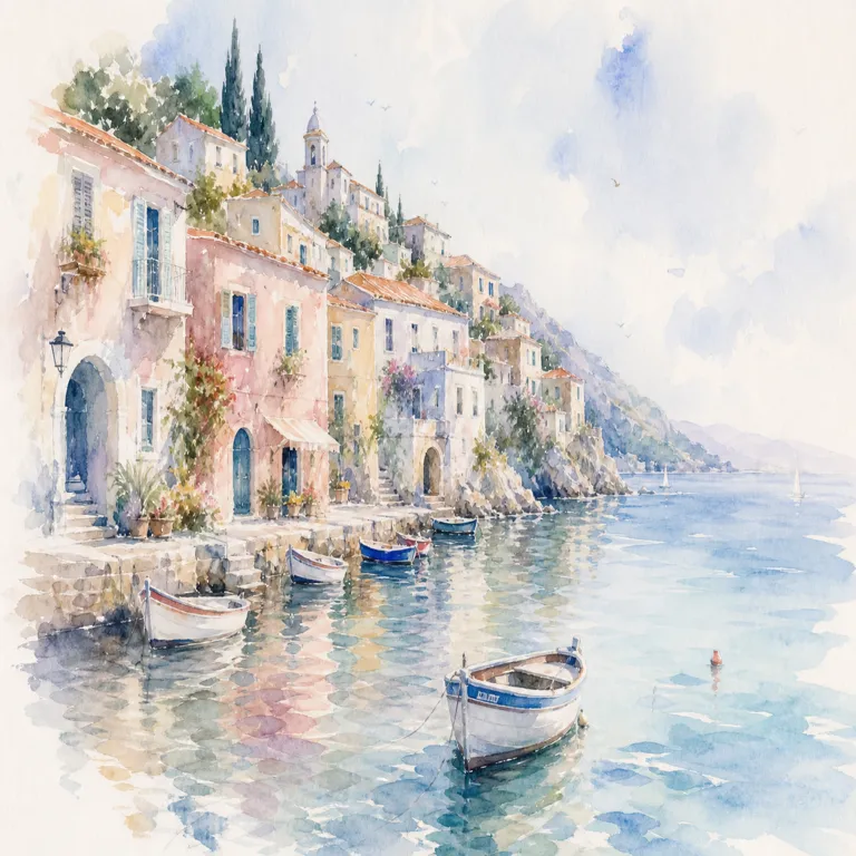
An AI-generated image that looks sharp on a screen is not automatically ready for print. Printing gives the pixels a physical size, converts colors through a specific device and paper, and exposes defects that a bright display can hide. The right workflow begins with the printer's specification and ends with a proof—not with a generic “300 DPI” export button.
This checklist covers the decisions a designer should verify for posters, packaging mockups, cards, editorial pages, and other common print uses. It is not a substitute for the requirements from your print provider. Their bleed, profiles, total ink limits, PDF standard, and finishing instructions control the job.
Get the production specification first
Ask for:
- final trim size;
- bleed and safe margins;
- printing process and paper stock;
- preferred color space or ICC profile;
- required file format and PDF standard;
- target effective resolution;
- rich-black recipe, if applicable;
- spot colors, varnish, white ink, or cutting layers;
- proofing method and deadline.
Do this before generation when composition depends on the shape. A square image cannot become a tall package panel without cropping or extending. Special finishes may require clean separations that should not be embedded in a flattened generated image.
If the provider says “high resolution” without a number, ask for the expected pixels per inch at final size or for a sample template. Requirements vary by viewing distance, process, substrate, and image content.
Calculate effective resolution
Digital image files contain pixels. The effective pixels per inch depends on how large those pixels are printed:
effective PPI = pixel dimension ÷ printed dimension in inches
A 3000 × 2400 pixel image placed at 10 × 8 inches has 300 PPI in both directions. The same image enlarged to 20 × 16 inches has 150 PPI.
Layout applications may show both an image's nominal resolution and its effective resolution after scaling. The effective value is what matters. A metadata field claiming 300 DPI does not create detail; changing that number without resampling only changes the intended physical size.
Do not upscale blindly to satisfy a numeric gate. Inspect faces, hands, lettering, edges, repeating patterns, and fine product detail at realistic print size. Upscaling may smooth pixels while preserving a structural error.
Generate for the final composition
Use the final aspect ratio and reserve trim-safe content. Keep faces, logos, small objects, and meaningful edges inside the safe area. Extend backgrounds beyond the trim into the bleed.
Bleed is image area that will be cut away to prevent a white edge after trimming. It is not an extra border. Background color and imagery should continue through it; essential content should stay away from it.
For campaigns with several sizes, follow the crop-safe composition workflow and create intentional masters. A poster, postcard, and narrow banner may need different arrangements even if they share the same subject.
Inspect generated defects before retouching
Print amplifies small problems. Review at high zoom and at final physical size:
- malformed hands, eyes, teeth, or repeating objects;
- inconsistent product geometry;
- accidental pseudo-text or near-logos;
- halos around cutout edges;
- banding in gradients and skies;
- blotchy low-detail surfaces;
- abrupt texture changes from outpainting;
- compression blocks;
- oversharpened edges;
- fine lines that may break on press.
Repair from verified source material where accuracy matters. Do not sharpen a wrong label or invented product component into looking more authoritative.
For exact lettering, place live or vector type after generation. The text-in-AI-images workflow provides checks for spelling, hierarchy, and accessibility. Rasterized display lettering can be part of an illustration, but legal copy and product information should remain editable.
Manage color with the printer
Most image generators and web images arrive in an RGB color space. Many print workflows ultimately use CMYK inks, but the correct conversion depends on the press, paper, and provider. Do not convert to an arbitrary CMYK profile simply because “print uses CMYK.”
Ask whether the printer wants:
- tagged RGB images and a color-managed PDF;
- images converted to a supplied CMYK profile;
- a particular standard such as a named regional condition;
- spot colors kept separate.
Soft proof with the intended profile on a calibrated display when possible. Bright blues, greens, oranges, and luminous gradients may fall outside the printable gamut. The conversion can reduce saturation or change contrast. Adjust the image while viewing the proof rather than trying to preserve impossible screen color.
Paper changes appearance. Uncoated stock generally reduces contrast and saturation compared with a bright coated sheet. A physical proof is more reliable than a phone screenshot.
Treat black intentionally
Small black text and thin rules usually need a simple single-ink black to remain sharp. Large dark backgrounds may use a printer-approved rich black built from multiple inks. The exact recipe and total ink coverage depend on the production condition.
Generated near-black backgrounds often contain uneven RGB noise and subtle color casts. Decide whether that texture is intentional. Large areas may benefit from a controlled background built in the layout rather than a raster field that is almost, but not quite, neutral.
Never invent a rich-black mix without the provider's guidance. Excess ink can cause drying and registration problems.
Choose a suitable master and delivery format
Keep a lossless, tagged master before making delivery copies. TIFF, PSD, or another workflow-appropriate lossless format may be useful for raster editing; the final job may be delivered as a PDF that also contains vector type and layout.
Avoid repeated JPEG saves. Each lossy generation can introduce more artifacts, especially around text, edges, and smooth gradients. If JPEG is required for an intermediate system, export once from the master at an appropriate quality.
For transparency, confirm whether the layout and PDF workflow supports it reliably. Flattening rules, overprint, and spot-color interactions should be checked in a professional preflight tool when the job is complex.
Build the page in the layout application
Place the image at final size rather than baking all production elements into one bitmap. Add:
- exact type;
- logos from approved vector files;
- crop marks only if the printer requests them;
- bleed defined in the document;
- spot and finishing layers with required naming;
- image and document profiles;
- page boxes required by the workflow.
Check linked-image status and effective resolution after scaling. A designer may prepare the image correctly, then enlarge it in layout and fall below the target.
Export using the provider's preset where available. Generic presets can make different choices about downsampling, compression, color conversion, and font embedding.
Preflight the exported file
Open the actual delivery PDF or image—not only the source document—and verify:
- trim dimensions and page count;
- bleed on every required edge;
- safe placement of important content;
- effective image resolution;
- correct color spaces and profiles;
- no accidental RGB/CMYK conversion of spot layers;
- embedded fonts or outlined type as specified;
- no missing links or low-resolution proxies;
- overprint behavior;
- transparency rendering;
- thin-line and small-text integrity;
- filename, version, and orientation.
Zoom out and inspect the complete piece, then zoom in on critical areas. Print a 100 percent desktop proof for size and hierarchy when the format allows it. A small office printer is not a color contract proof, but it can reveal that type is too small or margins feel wrong.
Approve a proof under appropriate light
For color-critical or expensive work, request a contract proof or press proof that represents the production condition. Review it under consistent lighting. Compare to the intended hierarchy and product truth, not to the most saturated version on a phone.
Record the proof approval, profile, export preset, and delivered checksum or version. If the printer makes a correction, preserve the returned file and note what changed.
A compact AI-to-print workflow
- Get trim, bleed, profile, resolution, and delivery specifications.
- Generate at the intended ratio with safe composition.
- Inspect structural defects and product truth.
- Retouch from a lossless master.
- Add exact typography and brand assets in layout.
- Soft proof with the requested production condition.
- Export using the printer's preset.
- Preflight the exported file.
- Approve a suitable physical proof.
- Archive sources, settings, and the approved delivery.
You can explore print-oriented compositions with BananaLite and use the product shot-list guide when the printed piece advertises a real object. The final verification remains a production responsibility.
Sources and further reading
- Ghent Workgroup specifications — industry-developed PDF production and preflight specifications.
- International Color Consortium — primary background on ICC color management and profiles.
- Library of Congress recommended formats for still images — format characteristics for durable image masters.
- Adobe: image size and resolution — practical explanation of pixels, print dimensions, and resolution.
Print readiness is a chain of verified decisions. Start with the provider's real specification, preserve an honest master, and judge the exported proof—not the generator preview.